

New Spirit Paintjob....

 09-17-2014, 08:42 PM
#43
Gets Weekends Off
Joined APC: Jan 2009
Posts: 1,459
I think the solid yellow color is good. My problem is with the hip, faddish, sketchy font and "bare fare" on the cowling. No class in the design. Affordability doesn't have to be without a touch of class.
This design is appropriate for a website that can be updated with a few keystrokes - but an entire fleet livery? Bad move.
The design team should have been fired or sent back to the drawing board - this will look so dated in 3 or 4 years.
And all you guys who say you like it - your comments are qualified with terms like " You know what... I like it " " It gets the job done " etc. No one on here has said: "This is freakin' awesome!" Why? Cause it's awful.
09-17-2014, 11:04 PM
#45
Gets Weekends Off
Joined APC: Jun 2008
Posts: 647
Marketing did exactly what it was intended to do: get people talking about it. Whether someone likes it or not is irrelevant. With social media, we will be on every passenger newsfeed across the country and beyond. It's the old Benetton marketing strategy. Well played.
09-18-2014, 03:49 AM
#46
Banned
Joined APC: Jan 2006
Position: A-320
Posts: 6,929
Originally Posted by sulkair

I think the solid yellow color is good. My problem is with the hip, faddish, sketchy font and "bare fare" on the cowling. No class in the design. Affordability doesn't have to be without a touch of class.
This design is appropriate for a website that can be updated with a few keystrokes - but an entire fleet livery? Bad move.
The design team should have been fired or sent back to the drawing board - this will look so dated in 3 or 4 years.
And all you guys who say you like it - your comments are qualified with terms like " You know what... I like it " " It gets the job done " etc. No one on here has said: "This is freakin' awesome!" Why? Cause it's awful.
This design is appropriate for a website that can be updated with a few keystrokes - but an entire fleet livery? Bad move.
The design team should have been fired or sent back to the drawing board - this will look so dated in 3 or 4 years.
And all you guys who say you like it - your comments are qualified with terms like " You know what... I like it " " It gets the job done " etc. No one on here has said: "This is freakin' awesome!" Why? Cause it's awful.
 09-18-2014, 04:53 AM
#47
MK Ultra Candidate
Joined APC: Feb 2013
Position: Prime Leader of Boko Harumph
Posts: 1,167
Originally Posted by NYGiantsFan
Do you ever wonder why pilots get taken out behind the woodshed at every amenable date?
Ya'all are dorks!
09-18-2014, 05:05 AM
#48
Banned
Joined APC: Jan 2013
Posts: 45
Originally Posted by ClickClickBoom
I think anybody who gets excited about a stupid airplane paint job, needs to get a life, look squirrel!
Do you ever wonder why pilots get taken out behind the woodshed at every amenable date?
Ya'all are dorks!
Do you ever wonder why pilots get taken out behind the woodshed at every amenable date?
Ya'all are dorks!
09-18-2014, 07:05 AM
#50
Gets Weekends Off
Joined APC: Apr 2009
Position: A320 CA
Posts: 705
Originally Posted by gatorbird
Gay Pride Hurricane Warning livery debuted in 2007.
 . Oh yeah I love the new paint job, I hated the current one when it came out as it was so far from the class of the "silver jet". The yellow though, it fits with the theme and I guarantee even on a dull dreary day with a low overcast it will be a standout.
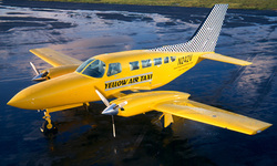
 The livery, along with other airlines mentioned, reminds me of Yellow Air Taxi that used to be based in FLL using Cessna 402s.
-2263

Thread
Thread Starter
Forum
Replies
Last Post


